Our Logo

Our Logo’s Story
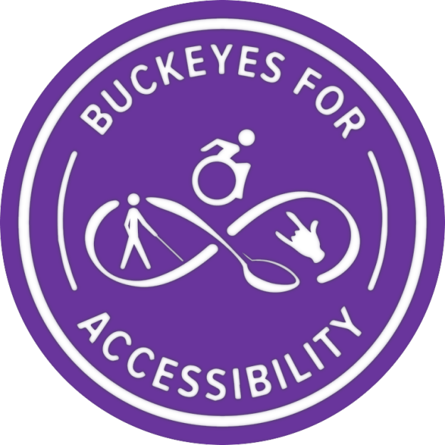
Our logo was created in August of 2021 by our then president Kayden Gill, with vital input and feedback from Leéna Boone the then Vice President, and the rest of the B4A family. This design was was born from Kayden’s and all involved’s desire to find a way to represent all of the Disability community together as one, but without loosing the nuance of each group.
We engaged in days of discussion brainstorming, providing feedback, and checking with each community about their thoughts and feelings to avoid using cliche or infantilizing symbols.
The logo was previously scarlet but was recently changed to purple.
If you use this image please include the following image description:
[Alt: B4A’s logo, the name Buckeyes for Accessibility in white text on a purple circle background encircles the logo of an infinity loop connected by a spoon for the Neurodiverse and Chronic Illness Community. Above the center of the loop’s intersection sits a modern active wheelchair user symbol representing the Physical and Mobility Disability communities. In the right loop is a hand signing the shorthand for “I love you,” in ASL for the Deaf and Hard of Hearing community. In the left loop is a white cane user representing the Blind, Low Vision, and Visually Impaired community. All communities united together.]